PB FARM

See the Dish. Know the Sauce.
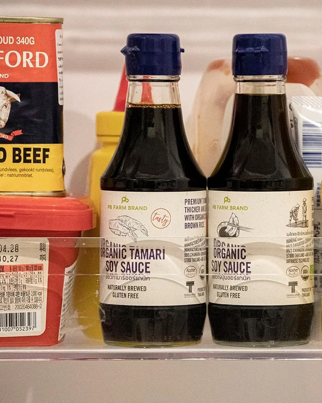
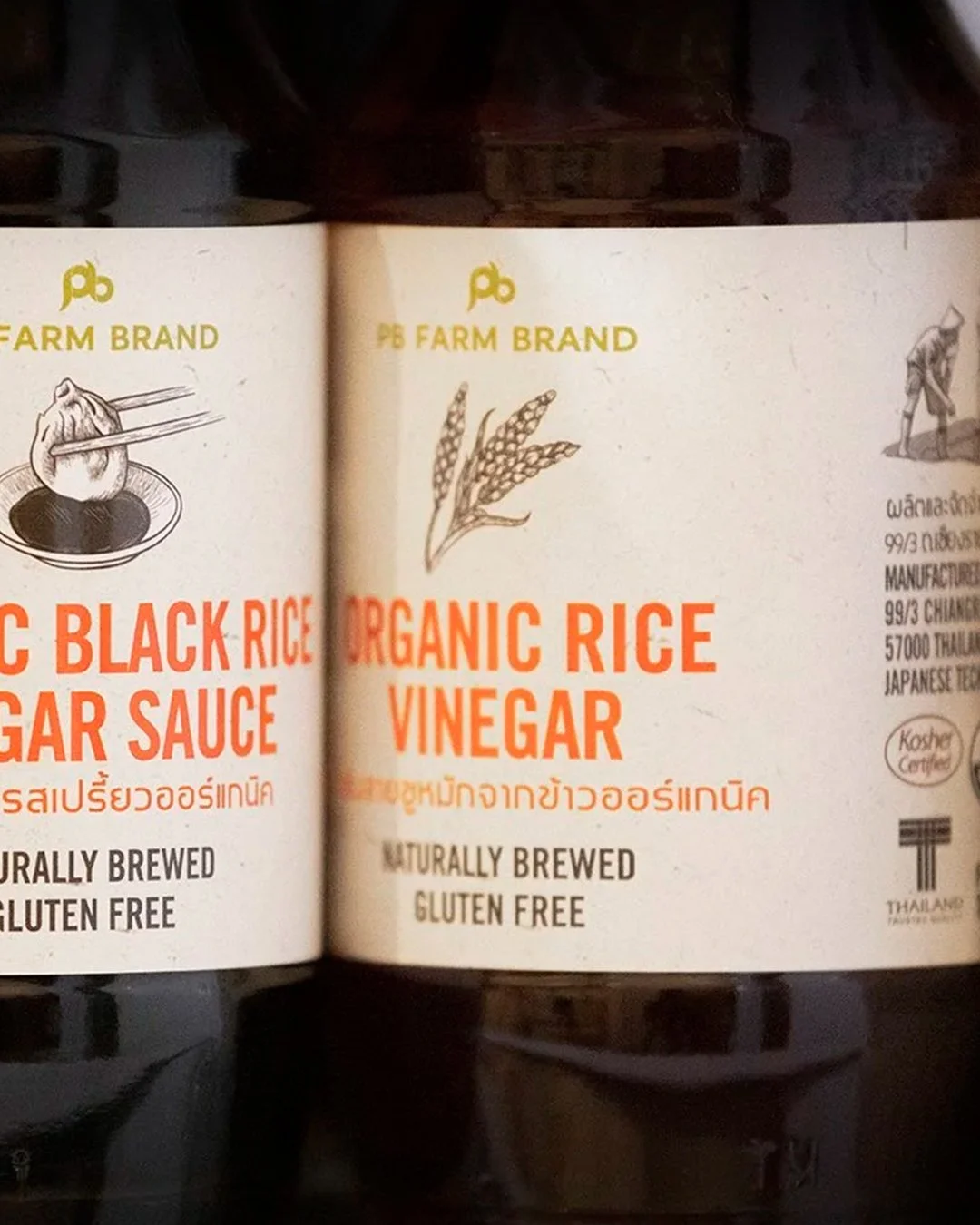
With twelve sauces, each created for a different flavor, dish, and way of cooking, PB Farm needed more than color to tell them apart. We turned the range into a visual language of food—using illustration to connect each sauce directly to the dishes it was made for. The idea is simple: see the dish, know the sauce. The packaging itself becomes an intuitive guide, making choice easier without requiring culinary knowledge.
OUR APPROACH
We created a distinctive series of dish illustrations that gives each sauce an immediate visual cue. Working alongside color, typography, and a clear packaging hierarchy, illustration transforms a complex product range into a simple, recognizable system.
Each label has its own character while remaining unmistakably part of the same family—turning information into illustration, and illustration into an effortless way to choose.
DESIGN SCOPE
Creative Direction · Label Design · Illustration · Information Design