INSEE MORTAR

BUILT FOR CLARITY.
INSEE Mortar turns professional construction materials into a system that is easier to recognize, understand, and use. For its range of ready-to-use dry mortars, CASESTUDY created a packaging language that brings visual order to a highly functional product category—without losing the strength and familiarity of the INSEE brand.
OUR APPROACH
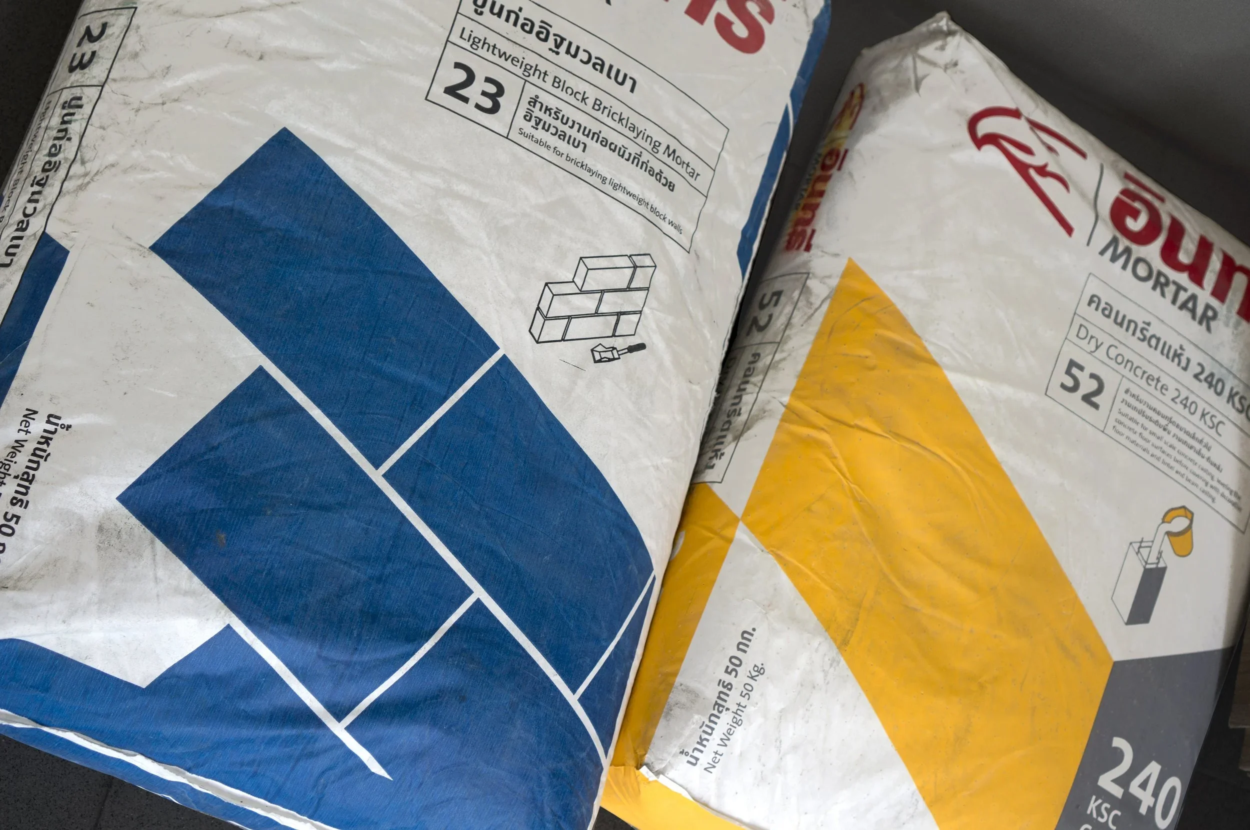
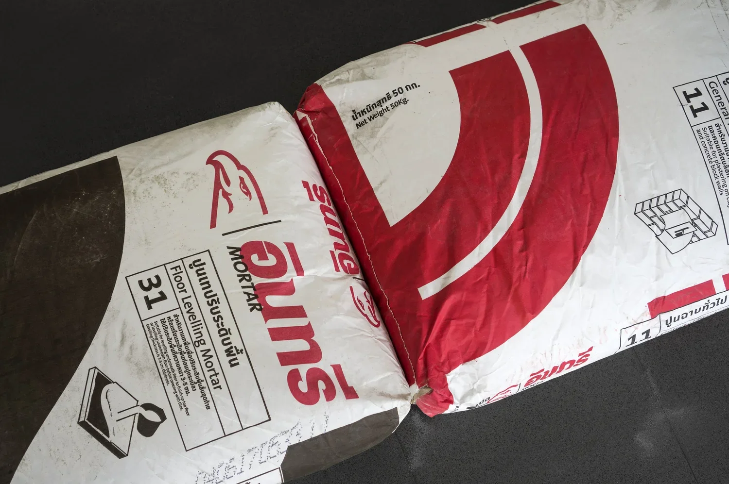
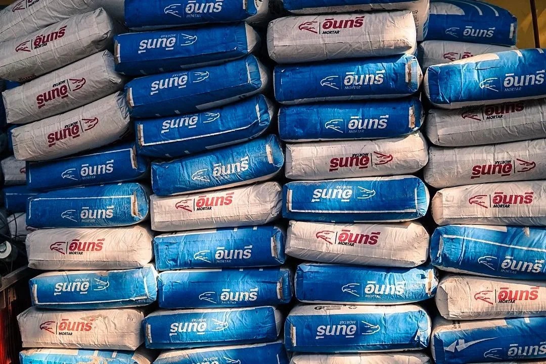
We transformed technical information into a clear visual system. Bold color coding distinguishes each mortar type, while oversized numbers, structured typography, and simple infographics make product selection and usage immediately understandable—even in the fast-moving environment of a construction site.
FORM FOLLOWS FUNCTION. COLOR CREATES ORDER.
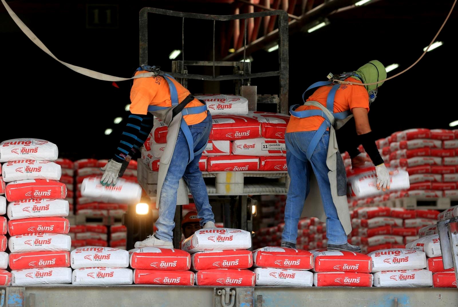
Across plastering, bricklaying, floor leveling, and tile applications, a consistent graphic framework gives each product its own identity while keeping the range unmistakably connected. Functional information becomes part of the design rather than something added to it.
DESIGN SCOPE
Creative Direction · Packaging Concept · Packaging Design · Visual Language · Information Design · Iconography · Art Direction